In this manual you will find the information you need to use the name and logo in your projects and documents regarding the approach.
Having consistency in how we promote and share information on the Inclusive Learning Approach will contribute to make the approach and your work more visible and recognisable.
The name – Inclusive Learning Approach
The approach
The Inclusive Learning Approach is a holistic approach to Inclusive Education that involves multiple stakeholders, such as children, parents, teachers, school leadership, communities, education authorities and Disabled People’s Organisations (DPOs).
We work with DPOs and governments to ensure Inclusive Education in local schools, so that children with disabilities can stay with their families, build social networks and be part of the local community together with other children.
The approach is developed by the Norwegian Association of Disabled (NAD) and the Enabling Education Network (EENET), in collaboration with local partners and stakeholders.
Logo usage manual
The logo usage manual consists of information on the new name and logo, the meaning behind, guidelines on usage of abbreviation and logo files, as well as logo files to download.
By using the name, abbreviation, and logo in the same way across projects and countries, the approach will become more recognisable and easier to remember.
The name – Inclusive Learning Approach
In 2022 we started the process of creating a new name for what is now called the Inclusive Learning Approach. Receiving 46 percent of the votes in a survey we shared with partners, the name was a clear favourite.
Inclusive Learning Approach is the name of the approach in its entirety. The approach has two main components which are called:
- the Inclusive Teaching Component
- the Inclusive Advocacy Component
Abbreviations
The correct abbreviation for the Inclusive Learning Approach is ILA or the ILA.
Please use ILA/the ILA when using abbreviation, and not TILA or other versions, to ensure that the approach is clear and recognisable.
It is important that we only use the abbreviation when the full name has been introduced, so that we communicate information on inclusive education and the approach clearly, even to the ones that are new to the subject.
We should avoid using abbreviations for the two components.
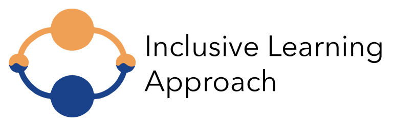
The logo
After selecting the name, we started the process of creating a logo that would fit the approach. Following an ideation process, we presented our partners with three potential logos, and with the help of all of those who voted in the survey, this became our logo with over 77 percent of the votes.
![]()
The logo consists of a symbol and of a name. Both are meant to be used together, to ensure that the logo is recognisable and easy to remember.
The font used for the logo is called Avenir.
The meaning behind the logo
The logo symbolises several aspects of the approach. Perhaps you have already noticed it?
The two components of the Inclusive Learning Approach, the Inclusive Teaching Component and the Inclusive Advocacy Component, are visualised in the two largest circles. The logo also shows two people-like shapes holding hands, symbolising inclusivity, cooperation, and community. While the two contrasting colours symbolises the importance of diversity.
Download logo files here
Download the colour version
![]()
ILA logo - small size colour version (768×248)
ILA logo - full size colour version (2350×758)
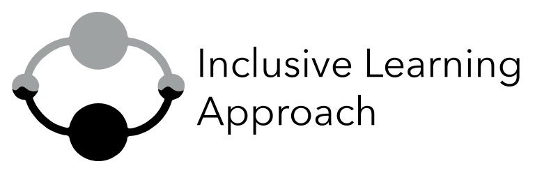
Download the black and grey version
![]()
This version can be used for documents that will be printed in black and white.